For my final project, I chose to do a web page illustrating all the concepts we learned this semester. I made a page in which I review a game controller. This brings us to the first point. Know Your Audience I chose to name the site Video Game Hardware Reviews. I made a banner image that clearly depicts the title and an image of a video game controller. This is the first hint to the reader as to what this site might be about.
There is a short blurb on the sidebar which tells what the site is about. It says that the site reviews equipment for video game systems. If this were a full site, I would also include a fully featured about page.
I addressed the audience in the article, referring to them as "you." I learned in this course that that speaks better to people who are reading pages. I happen to agree. Since this is a review site, I am talking directly to consumers who might want this product. It makes sense to address them. Subheadings and Small Paragraphs Since the site is designed for people who are looking for information on video game hardware, the article is broken up into sub sections which includes all the information about the product. In this case, the sections are size and information about the various buttons and how they function.
The subheadings are important in case people want just one bit of information about the product. This is how people look at things on the internet. For example, if I were visiting this site, I would be saying in my head, "Blah blah, but does it have a good D-Pad?" I have bought a number of controllers in the past with bad D-Pads, so I would jump right to that section. Other people might have different concerns, like size or triggers.
Each of the paragraphs is small and conveys a bit of the information. This makes it easy to skim and find out if an individual section has the information required. Images I included three small images in the body of the page. One is a picture of the product. If you click the image, you can see a larger version in a separate tab.
The second image is a closeup comparison between this controller's directional pad and the original Xbox 360's. This highlights the differences better than the paragraph ever could describe.
The final image is the score number, which was just for fun. Overall Layout and Design The layout of the page is simple, but the colors and design of the header image are pleasing to me. I hope other people feel the same.
The colors are very neutral and very legible. The sans serif font looks clean and the font color contrasts well with the background. All of these were particular considerations as I create the site.
At the bottom of the page, there is a link to the product being described. You would expect it either there or at the top. This way, if people are reading and decide they have enough information, they can click right to the order page. Conclusion I believe all of the aspects of this page illustrate the things I have learned this semester. Knowing the audience, knowing how they browse pages, and knowing what makes for a good looking page all go into the process of digital writing. It is impossible to write a good page for the internet without thinking about the design and the people who will read it. These things are integral to the writing process. The page can be found here.
Creating this site was a lot of fun. I have made websites before, but usually I am wary of complicated CSS because you have to test the layout many times to get it right. However, because I wanted to get a good grade on this project, I was motivated to explore more impressive site layouts which would include more complicated CSS. I was surprised how proud I became of my CSS work on this site! It looks so good. I feel like I have enough skills now to create as complicated of a website as I can imagine. The interesting think about coding is it is never really necessary to memorize how to do everything, it is merely important that you can figure it out once. I feel like I have the basic knowledge now to find whatever I want to do from the internet and make it work. It is interesting to think about coding while making the content. I wanted to just type the content out in a text editor with no code, just to get it out of my head and onto the screen. As I was typing, I began to draft the layout in my mind, and pretty soon my plain text document was littered with HTML. Considering the web layout as you write is considering the audience. It is considering how people will view your writing. If there is one lesson I take away from this semester it is to always consider your audience. Considering the audience does not mean dumbing down the content, it simply means making it accessible to your audience. Headers, bullets, small paragraphs, graphics, and multiple columns are all ways to better communicate the messages in your writing. Just like "art," the word "writing" inherently includes a value judgment in the terminology. Do blogging, tweeting, GIMPing, Meme-ing, and coding count as writing? Yes. They are all about communicating a message, and the same considerations should go into these types of writing as the more formal types.
For the HTML Design Project, I have decided to put some of my analysis of ensemble comedy into words. There are many similar aspects among different ensemble comedy shows. These "tropes" align to create a sort of genre of comedy show with many interacting characters. I chose this topic because it is something I spend a lot of time thinking about. I have written a few shows, myself, so putting it into words might make things even clearer for myself.
This will be an informative site intended for people who want to study or write comedies, for television or movies. I will present structure that is inherent to these shows and introduce examples from popular television to illustrate my points. While the site will mainly be for those who want to write their own comedies, it may be of interest to those who see patterns in television and want to know more about them.
I plan to make the site simply styled: single column with sub-sections and images. I also plan to include textbook styles with "Did You Know?" kind of interjections. These interjections will be tangentially related to the subject matter, but only really serve for a kind of trivia.
The writing on the page will be fairly simple. I will establish structure with lists and charts, and then explain individual points in detail. The information will be semi-formal and not academic.
Following the PowerPoint that we were emailed, I have changed a number of things in the style sheet for my test page. I inverted the colors to make the page easy to read in the dark. This required a change of the background for the page, header, footer, menu, and content area. Accordingly, I also changed the text color to white for high contrast. Although the original blue color of the links showed up on the gray background, it was a little difficult to read for some reason, so I changed the color of that to a light gray. It pops better and is easier to read against the dark gray background.
I made the image of the cake recipe smaller and used float:right to move it off to the side. It looks more professional that way.
I looked at fonts from the link in the PowerPoint, and while I was already assigning the Arial font to the page, the font site suggested that Arial is mainly for Windows, so I included an additional font of Helvetica. The fallback for the font is sans-serif so the page will look pretty much the same, no matter what.
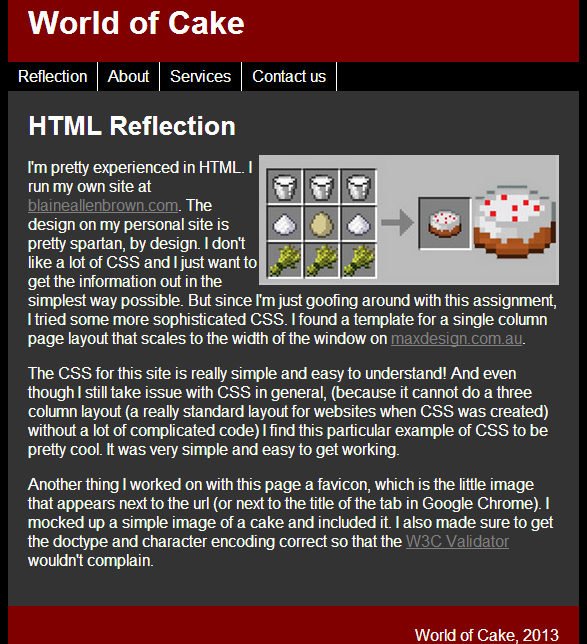
I'm pretty experienced in HTML. I run my own site at blaineallenbrown.com. The design on my personal site is pretty spartan, by design. I don't like a lot of CSS and I just want to get the information out in the simplest way possible. But since I'm just goofing around with this assignment, I tried some more sophisticated CSS. I found a template for a single column page layout that scales to the width of the window on maxdesign.com.au. The CSS for this site is really simple and easy to understand! And even though I still take issue with CSS in general, (because it cannot do a three column layout (a really standard layout for websites when CSS was created) without a lot of complicated code) I find this particular example of CSS to be pretty cool. It was very simple and easy to get working.
Another thing I worked on with this page a favicon, which is the little image that appears next to the url (or next to the title of the tab in Google Chrome). I mocked up a simple image of a cake and included it. I also made sure to get the doctype and character encoding correct so that the W3C Validator wouldn't complain.The full page can be seen here.
I feel like I have to take back a good deal of the things I said in my previous posts for this reflection. I am now an expert in this information. After working to fill in our group's page with more information, I have internalized the points listed. I went on a rampage of fixing the other groups' pages to look like mine, since I had designed it with the very points I wrote about. - I removed space after headings so that it linked the heading with the rest of the text and did not float.
- Weebly does not enforce a template for each page. You can format the headings and subheadings however you please. I went around and made them all to look like our page. Heading 1 for the page subject, Heading 2 for sub-sections.
- I added a space after bulleted lists. Often, they bled right into the rest of the text.
- I broke up some paragraphs into smaller sections when they seemed like large walls of text.
I am sure that even as I write this reflection, my changes are being re-changed and I might not be happy with them. But that is the nature of the wiki. Perhaps someone has a greater plan for the overall look of the site. Or maybe my design changes do not reflect the content in the best way. I don't know because I didn't read each article entirely. I do enjoy the fact that I have become an expert on these points of formatting for pages. I did not expect to want the pages to look a certain way. I thought I would simply do my classwork without fervor. But I became empassioned with desire for the page to look a certain way. And I can walk away from the wiki knowing that after I clicked save, the information was clearer, more concise, and more attractive.
Creating a wiki has proven more difficult that expected. Given the assignments of chapters 7 and 11, it would seem like we have a place to start, but that is not the case. We have a lot of decisions to make. What information should we include and what should we exclude? Should we just follow how it is presented in the book? Or is that order only helpful in a text format? It feels very much like starting from scratch.
It is interesting to know that people who write in wikis often start like this, trying to figure out what information is relevant and how that information should be presented. However, I feel like I have been vindicated in my fear that since we are not experts in the information being included in the wiki, we lack the experience to know which information is important and where emphasis should be placed. I don't really have an opinion on how this information should be displayed.
Furthermore, I'm not sure what information is common sense and what is important enough to include. Some of the points, for example, seem very similar. What is the difference between "Make the page elements obvious, using patterns and alignment," "Consider the entire site when planning the design," and "Work with templates"? They all seem to be a related point of making the webpages work together. Maybe we should show the information that way? Or would it be better to keep it like the book? Hard to decide.
A wiki is a collaborative project that focuses on a topic (or all topics) in a purely factual way. A wiki brings together users who have a particular expertise and interest in any given topic. A good wiki article includes sources, and spirals information out, starting with the most basic information, and moving more into depth as the article progresses. This is important because often people use a wiki to get general bit of information, and others can look at each section in order to get more specifics, if they so desire. A lot of thought should go into how a wiki will be read by a user.
My concern with this project, is that a key quality of the success of a wiki is that it is voluntary. This allows for only the most motivated people to contribute, which, has obviously led to incredibly accurate information in places like Wikipedia. Who is more motivated to have good information on a topic than an expert? We have been assigned a chapter of the text book containing information for which none of us are experts. I believe through this project we will get a good sense of the editing and self correcting process that wikis can provide, but I don't believe we will have the feeling of contribution to our area of expertise.
InstructionsThe purpose of this assignment is to get you used to writing in a neutral tone and to practice structuring. Each of the groups will be assigned a topic related to the class. Group #1: Blogs. Group #2: Gimp. Group #3: Wikis. Group #4: Twitter. You are to create a stub, or a short entry about the topic that has been chosen. Be ready to share these stubs with the rest of the class for discussion. Look at the readings for references to style, structure, content, and tone. After discussion, post the stubs to a group member’s blog along with ideas of how the stub can be expanded. Due by midnight on Sunday. WikiWikis are websites that allow users to add, delete and edit pages as well as the content within them. The content on a wiki is designed to be factual. Wiki allows users to work on information collaboratively and tracks changes to the document that each user makes. Typically, wikis are self-enforced, meaning the community of users monitors and corrects errors. Most Wiki’s have a “reference” section that allows the user to navigate to a reliable source in which the information on the wiki came from. There are many types of wikis. Wikipedia acts as a user generated web encyclopedia, while other wikis have a more specific focus for a special interest, such as Bulbapedia, which catalogues information on the Pokemon franchise. ExpansionThis is a very surface level entry for Wikis. Expansion of the wiki on wikis should go into more detail in many subdivisions of the article. Since wikis are supposed to spiral out in complexity, this entry could expand to include how wikis are written, what software is used, how they are formatted, how pages are linked together etc. Assignment by Blaine Brown, Kendall Johnson, Dawn McGinnis, Mei Chen, and Trey Chumchal
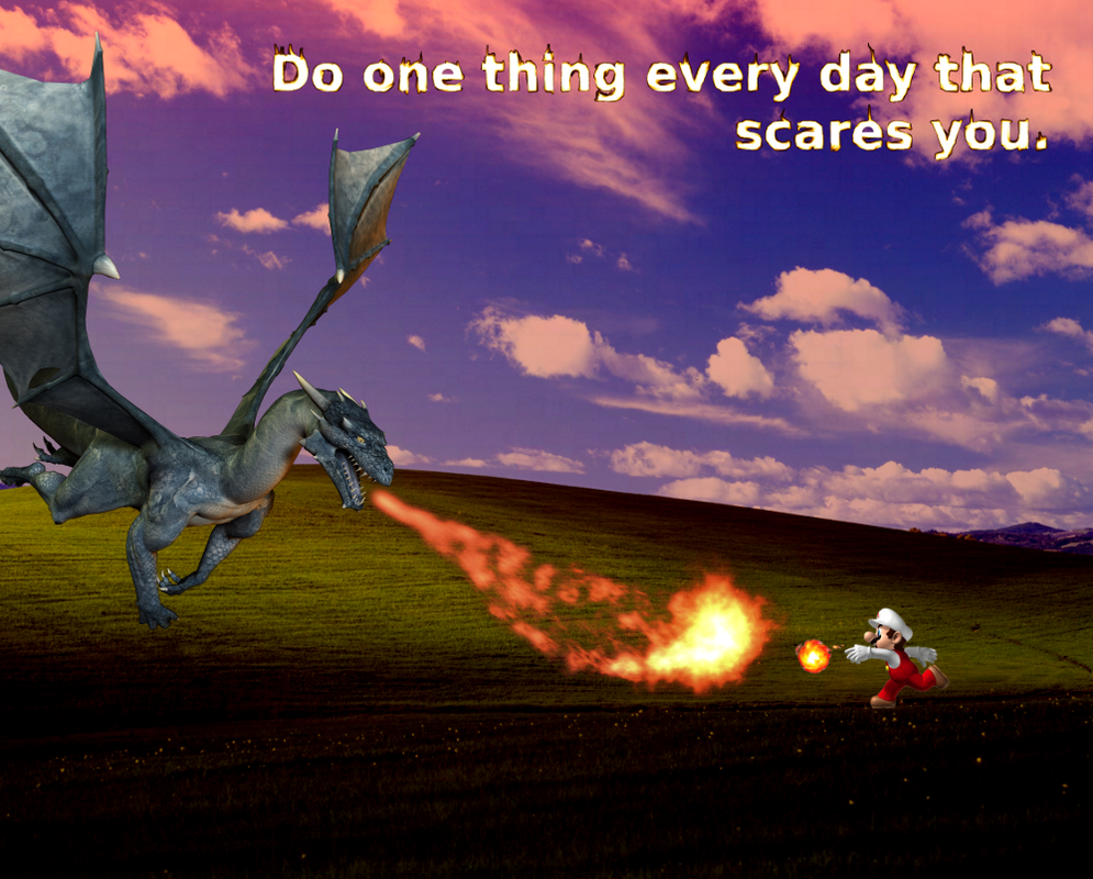
"Do one thing every day that scares you." -Eleanor Roosevelt
InterpretationThis quote means that you have to challenge yourself. By doing one thing every day that scares you, you can learn what is possible. You can learn about yourself. Mario represents this quote very well. Mario games are somewhat easy, if you take it slow. The thrill of beating a Mario level comes from doing it stylishly and fast. By pushing yourself to move through the level quickly, you have to trust your ability to adapt. You don't look before you leap; you leap and react. When you leap into the air and see an open pit before you, your muscles tense and you tilt the controller, hoping it will give you a little bit more distance. It is only when you've felt this fear and made it across the other side, that you have truly lived in a Mario game. Always do the thing in a Mario level that scares you, because that is where personal growth lies. ProcessTo create this image, I took the Windows XP default background of rolling hills titled Bliss and set the layer to "Grain Merge" with a red background below it. I took an image of a dragon and a separate image of the fire breath and placed them to confront a Mario graphic. Lastly, I created a new layer with the quote in white letters and smudged each letter (which was very time consuming) to appear to be on fire. I messed with the colors of that layer until it was a nice orange flame. Mario is fighting a dragon on a dark landscape that used to be blissful. Now it is terrifying, as the quote implies. Image Manipulation and Digital WritingIn the same way that a meme is digital writing, this image says more than the quote could say alone. Even more, although the quote is by Eleanor Roosevelt, I am also making a personal statement about the idea by including my specific Mario example. I am communicating what the quote means to me.
|
 RSS Feed