Creating this site was a lot of fun. I have made websites before, but usually I am wary of complicated CSS because you have to test the layout many times to get it right. However, because I wanted to get a good grade on this project, I was motivated to explore more impressive site layouts which would include more complicated CSS. I was surprised how proud I became of my CSS work on this site! It looks so good. I feel like I have enough skills now to create as complicated of a website as I can imagine. The interesting think about coding is it is never really necessary to memorize how to do everything, it is merely important that you can figure it out once. I feel like I have the basic knowledge now to find whatever I want to do from the internet and make it work. It is interesting to think about coding while making the content. I wanted to just type the content out in a text editor with no code, just to get it out of my head and onto the screen. As I was typing, I began to draft the layout in my mind, and pretty soon my plain text document was littered with HTML. Considering the web layout as you write is considering the audience. It is considering how people will view your writing. If there is one lesson I take away from this semester it is to always consider your audience. Considering the audience does not mean dumbing down the content, it simply means making it accessible to your audience. Headers, bullets, small paragraphs, graphics, and multiple columns are all ways to better communicate the messages in your writing. Just like "art," the word "writing" inherently includes a value judgment in the terminology. Do blogging, tweeting, GIMPing, Meme-ing, and coding count as writing? Yes. They are all about communicating a message, and the same considerations should go into these types of writing as the more formal types.
For the HTML Design Project, I have decided to put some of my analysis of ensemble comedy into words. There are many similar aspects among different ensemble comedy shows. These "tropes" align to create a sort of genre of comedy show with many interacting characters. I chose this topic because it is something I spend a lot of time thinking about. I have written a few shows, myself, so putting it into words might make things even clearer for myself.
This will be an informative site intended for people who want to study or write comedies, for television or movies. I will present structure that is inherent to these shows and introduce examples from popular television to illustrate my points. While the site will mainly be for those who want to write their own comedies, it may be of interest to those who see patterns in television and want to know more about them.
I plan to make the site simply styled: single column with sub-sections and images. I also plan to include textbook styles with "Did You Know?" kind of interjections. These interjections will be tangentially related to the subject matter, but only really serve for a kind of trivia.
The writing on the page will be fairly simple. I will establish structure with lists and charts, and then explain individual points in detail. The information will be semi-formal and not academic.
Following the PowerPoint that we were emailed, I have changed a number of things in the style sheet for my test page. I inverted the colors to make the page easy to read in the dark. This required a change of the background for the page, header, footer, menu, and content area. Accordingly, I also changed the text color to white for high contrast. Although the original blue color of the links showed up on the gray background, it was a little difficult to read for some reason, so I changed the color of that to a light gray. It pops better and is easier to read against the dark gray background.
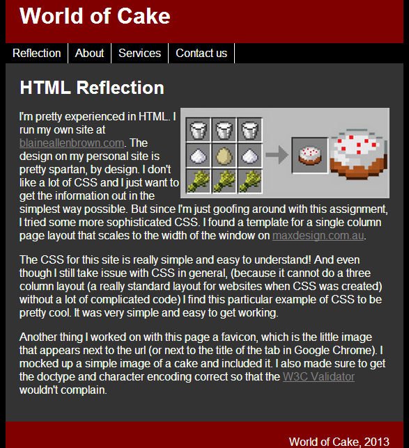
I made the image of the cake recipe smaller and used float:right to move it off to the side. It looks more professional that way.
I looked at fonts from the link in the PowerPoint, and while I was already assigning the Arial font to the page, the font site suggested that Arial is mainly for Windows, so I included an additional font of Helvetica. The fallback for the font is sans-serif so the page will look pretty much the same, no matter what.
Creating a wiki has proven more difficult that expected. Given the assignments of chapters 7 and 11, it would seem like we have a place to start, but that is not the case. We have a lot of decisions to make. What information should we include and what should we exclude? Should we just follow how it is presented in the book? Or is that order only helpful in a text format? It feels very much like starting from scratch.
It is interesting to know that people who write in wikis often start like this, trying to figure out what information is relevant and how that information should be presented. However, I feel like I have been vindicated in my fear that since we are not experts in the information being included in the wiki, we lack the experience to know which information is important and where emphasis should be placed. I don't really have an opinion on how this information should be displayed.
Furthermore, I'm not sure what information is common sense and what is important enough to include. Some of the points, for example, seem very similar. What is the difference between "Make the page elements obvious, using patterns and alignment," "Consider the entire site when planning the design," and "Work with templates"? They all seem to be a related point of making the webpages work together. Maybe we should show the information that way? Or would it be better to keep it like the book? Hard to decide.
A wiki is a collaborative project that focuses on a topic (or all topics) in a purely factual way. A wiki brings together users who have a particular expertise and interest in any given topic. A good wiki article includes sources, and spirals information out, starting with the most basic information, and moving more into depth as the article progresses. This is important because often people use a wiki to get general bit of information, and others can look at each section in order to get more specifics, if they so desire. A lot of thought should go into how a wiki will be read by a user.
My concern with this project, is that a key quality of the success of a wiki is that it is voluntary. This allows for only the most motivated people to contribute, which, has obviously led to incredibly accurate information in places like Wikipedia. Who is more motivated to have good information on a topic than an expert? We have been assigned a chapter of the text book containing information for which none of us are experts. I believe through this project we will get a good sense of the editing and self correcting process that wikis can provide, but I don't believe we will have the feeling of contribution to our area of expertise.
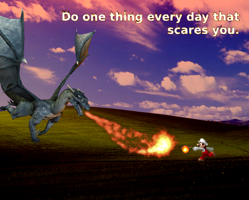
"Do one thing every day that scares you." -Eleanor Roosevelt
InterpretationThis quote means that you have to challenge yourself. By doing one thing every day that scares you, you can learn what is possible. You can learn about yourself. Mario represents this quote very well. Mario games are somewhat easy, if you take it slow. The thrill of beating a Mario level comes from doing it stylishly and fast. By pushing yourself to move through the level quickly, you have to trust your ability to adapt. You don't look before you leap; you leap and react. When you leap into the air and see an open pit before you, your muscles tense and you tilt the controller, hoping it will give you a little bit more distance. It is only when you've felt this fear and made it across the other side, that you have truly lived in a Mario game. Always do the thing in a Mario level that scares you, because that is where personal growth lies. ProcessTo create this image, I took the Windows XP default background of rolling hills titled Bliss and set the layer to "Grain Merge" with a red background below it. I took an image of a dragon and a separate image of the fire breath and placed them to confront a Mario graphic. Lastly, I created a new layer with the quote in white letters and smudged each letter (which was very time consuming) to appear to be on fire. I messed with the colors of that layer until it was a nice orange flame. Mario is fighting a dragon on a dark landscape that used to be blissful. Now it is terrifying, as the quote implies. Image Manipulation and Digital WritingIn the same way that a meme is digital writing, this image says more than the quote could say alone. Even more, although the quote is by Eleanor Roosevelt, I am also making a personal statement about the idea by including my specific Mario example. I am communicating what the quote means to me.
 The Wikipedia article on Super Mario World exemplifies all of the usual criteria for a good web article. Subheadings divide the article into plot, gameplay, development, and reception with additional subheadings within each section. There are links to additional information as well as scores from various game critic organizations. The sidebar has quick information like release date and platforms. Older VersionsWhen exploring older versions, it is possible to see what information has been filled in. For instance the quick info sidebar has much les information than the current version. There have been many changes to the page, updating and expanding its contents as time has gone by. TalkDiscussions on the Talk page include users trying to determine whether Super Mario World was ever included with a Super Mario All-Stars release. Some people claim to have seen versions where it was included with All-Stars (which included Mario 1, 2, and 3). There are many other discussions such as secrets that were included in the manual, an NES version of the game, and a secret hidden castle. These are unconfirmed, so that's why they are included on the talk page. A Trusted Source?This page shows all the ways in which Wikipedia tries to include only factual information. Factoids that are questionable are relegated to the talk page before they are allowed to be included in the main article. Wikipedia requires sources, which means that it can be as accurate as an academic paper. Often, Wiki articles are written by experts in the field, and to those who find a subject important, falsified information will be policed.
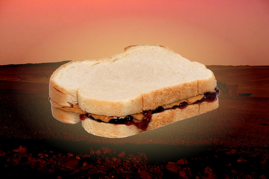
Here is something I made by messing around in Gimp. I merged a picture of a desert with a red background to make it look like Mars, and then I added a sandwich. I then used the gradient tool with a radial setting to make the sandwich seem like it's the most glorious thing in the Mars. Delicious.
While working on my site design, I went through the various points laid out in chapter 7 of Letting Go of the Words by Redish. It is a fun exercise to see the differences between designs and how they can affect the presentation of the content.
It is recommended to use a search box. I wanted to put that in the top of the right sidebar, but Weebly requires users to pay for search functionality. This is a shame because searching is a fantastic way for users to navigate a site when they know exactly the words they want to find. Savvy users could perhaps use a regular search engine, like Google, and type in "site:http://halloweenbagsearly.weebly.com/" and then their search term. Sometimes, however, the major search engines do not crawl blogs often enough.
With that in mind, I figured out a way to get a Google custom site search onto my page. However, searching for "persona" in that custom search yields no results even though one can clearly see two posts below containing the keyword.
I removed my name from the header, because it was off to the right in Passive Space. There's no reason to ever look over at that area, so I just left it blank. This resulted in a cleaner look. The site title in the heading is not a logo yet, (hopefully I can use part of the GIMP assignment to do this) but it is a clean, large font that is easily readable and is aligned with the rest of the content. I made sure the menu was aligned properly as well, even though I only have two pages at the moment.
The sidebar contains valuable information for the reader, including a quick summary about me (the "About" link in the top menu simply links to my "Introduction" post for now) including a link to my twitter account. I've also included the categories menu which will allow readers to select between "personal" posts and "group work" posts. This might be helpful for our instructor.
One could say my site layout is kind of plain, but I prefer to focus on the content and use a minimalist style. I believe that Redish supports my design sensibilities so hopefully the content on this page will begin to speak for itself.
Completeing the group project of generating a persona was an interesting example of the creative process at work. Normally, I am not too excited about teaching techniques that my instructors use. They are often too far removed from the content, or the information that is trying to be conveyed is not complicated enough to warrant such a project. The persona project, however, was incredibly helpful in explaining each aspect of a persona and an interesting way to look at web audiences.
Since we were required to create someone out of thin air, we simply came up with a name at random: Sara. Once we had this, I quickly typed her name into Google Image Search and pulled up a decent picture. We jotted down some quick facts about Sara: 22 years old, works part-time, lives on campus at ODU, single, etc. When we came to the description, something strange started to happen.
Sara became a person. She had dreams, goals. There were aspects of our make-believe University Library site that could affect her life. We started thinking about how and why she would be using the site. Tutoring, studying, using computers and other facilities and it became apparent how site design should be tailored to her uses. We gave her some quotes that indicate exactly what she wants out of the University Library's website.
This project was extremely helpful in understanding audience and how different groups approach the web in much the same way: they want relevant content fast. Not just content that is relevant to the site, but relevant to themselves.
|

 RSS Feed