Following the PowerPoint that we were emailed, I have changed a number of things in the style sheet for my test page.
I inverted the colors to make the page easy to read in the dark. This required a change of the background for the page, header, footer, menu, and content area. Accordingly, I also changed the text color to white for high contrast. Although the original blue color of the links showed up on the gray background, it was a little difficult to read for some reason, so I changed the color of that to a light gray. It pops better and is easier to read against the dark gray background.
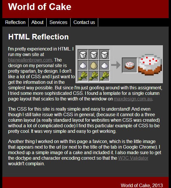
I made the image of the cake recipe smaller and used float:right to move it off to the side. It looks more professional that way.
I looked at fonts from the link in the PowerPoint, and while I was already assigning the Arial font to the page, the font site suggested that Arial is mainly for Windows, so I included an additional font of Helvetica. The fallback for the font is sans-serif so the page will look pretty much the same, no matter what.
 RSS Feed